Category: German Design

Mercedes war eine Dame

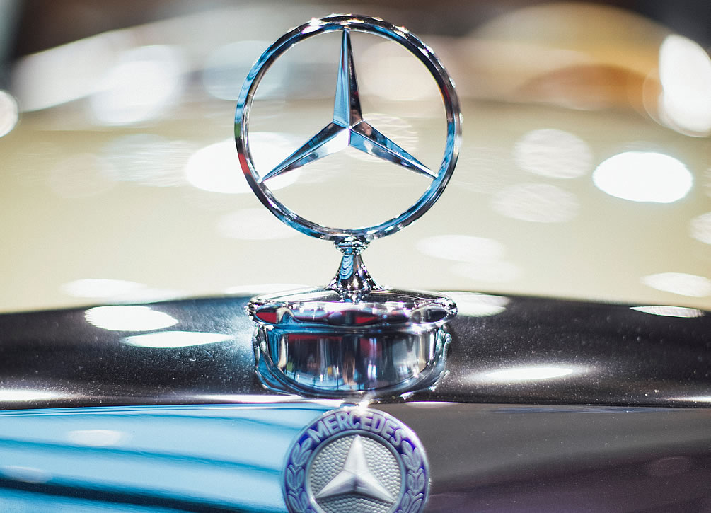
Autos mit dem dreispitzigen Stern – eines der bekanntesten Markensymbole der Welt – sind heute auf der ganzen Welt zu finden. Daimler-Benz mit Sitz in Stuttgart-Unterturkheim baut seit 1926 Automobile mit dem Namen Mercedes-Benz. Das Motto des Unternehmens lautet “Das Beste oder nichts”.

Wie hat das Mercedes-Automobile seinen Namen bekommen? Wer, eigentlich, war Mercedes?

Der österreichische Diplomat, Geschäftsmann und Autorennfahrer Emil Jellinek kaufte und modifizierte Autos die von Daimler (Daimler-Motoren-Gesellschaft) gebaut wurden um den Beginn des 20. Jahrhunderts. Jellinek arbeitete mit Wilhelm Maybach, dem Chefingenieur von Daimler zusammen um überlegene Automobile herzustellen (zu bauen).

Der Name Mercedes wurde erstmals im Jahr 1900 verwendet, als Jelenick einen modifizierten Daimler-Wagen nach seiner Tochter Mercedes benannte. Die Daimler- und Benz-Gesellschaften wurden 1926 zur Daimler-Benz zusammengelegt. Das erste Serienauto mit dem Namen „Mercedes-Benz“ wurde 1926 von der neuen Firma Daimler-Benz hergestellt.

So wurde eine der großen Automarken der Welt nach einer Frau benannt.

▸ Photo: Markus Spiske on Unsplash

The Typeface that Traveled to the Moon

How did a typeface designed in Germany during the 1920’s end up on the moon nearly a quarter of a century later?

The story begins in Frankfurt am Main, Germany, in 1924. At that time, just five years after the end of the First World War, the city was funding an affordable housing initiative. Some of Germany’s most prominent, modernist architects were involved in the project which produced a number of innovative buildings.

Paul Renner, a Frankfurt-based typographer, also played a role in this project. He developed a completely new, modern typeface that could be used in directional signage and on signs and informational graphics on and within the new buildings.

Renner began work on the new typeface in 1924. It was released three years later, in 1927, by Frankfurt’s Bauer Type Foundry. The modernistic, geometric, sans-serif typeface was appropriately named Futura. Futura was promoted as “die Schrift Unserer Zeit” (the typeface of our time) and, in English, as “the typeface of today and tomorrow”.

Simple, clear and legible, the Futura typeface was used extensively throughout the 20th century appearing in logos, advertisements and signage worldwide. Futura continues to be widely used today. Organizations that have used the Futura typeface include Volkswagen, Nike, Shell, IKEA, Swissair, AIG, Vogue, Vanity Fair and even the United States National Aeronautics and Space Administration – NASA.

NASA gave the Futura typeface still greater prominence through its Apollo space program. When the astronauts of NASA’s Apollo 11 mission landed on the moon, the descent stage of their Lunar Module displayed a stainless steel plaque with the following message:

Here men from the planet Earth first set foot upon the moon, July 1969 A.D. We came in peace for all mankind.

The typeface chosen by NASA for its moon plaque was none other than Futura.

The descent stage of the Apollo 11 Lunar Module was left on the moon. It remains there to this day, displaying its message in a typeface created over 90 years ago in Frankfurt, Germany.

▸ Images by NASA